
Note that Microsoft keeps tweaking the behavior of Excel, so your particular version of Excel may behave slightly differently from what is described here.
Getting data into Excel
You can simply type data into Excel: select a cell (by clicking on it) and start typing; press <Enter> when finished.
You can paste data into Excel. Copy from some other source, select the top left cell where you would like the data to go, and paste (Ctrl-V). If you’re lucky you’ll end up with one number in each cell. If you end up with many numbers in a single cell, select the cell and use the Data > Text to Columns command to prompt Excel to split the numbers out.
Label every column in your spreadsheet with (at a minimum) the variable name and units or measurement (mm, s, etc.). This will greatly simplify troubleshooting and will prevent many, many unit conversion mistakes.
Performing calculations with data (Formulas)
To generate information from a formula (i.e., to mathematically manipulate cells), click on a cell and type in a formula, beginning with =. All Excel entries for which you expect a numerical result/output MUST begin with an equals sign, =. Excel recognizes the usual binary operators: * (multiply), / (divide), + (add), – (subtract), ^ (exponentiate: 6² is rendered as =6^2).
Example: let us say you wished to multiply the entry in cell A1 by 60. To do this you would click on the cell where you wish the output to go and then type ‘=60*A1.’ You can type the input cell, A1, on the keyboard, or you can use the mouse to click on cell A1 while typing the formula. For more complex mathematical operations, parentheses often become necessary. Excel will color-code the parenthesis to help you see where each set opens and closes. Be VERY careful with your parentheses!
There are loads of tutorials on using Excel formulas, such as this one.
If you wish the same mathematical formula to be applied to every cell in a column (e.g., column F is column A times 60), type the formula into the output cell for the first row. Then click on the output cell and move your mouse over the bottom, right corner of the cell. Your pointer will change shape and become a plus. Press down the left mouse button, drag down to the last cell you wish to effect, then release the mouse button. The cells will automatically fill in. By clicking on any of these cells, you can see in the formula bar that the formula has been adjusted to reference the correct input cell (i.e., for the row you are currently in). As a shortcut, you can double-left-click the bottom right corner of the first row cell; the formula will propagate down to the bottom (defined as the last nonblank cells in the neighboring column). The same process can be used to copy a formula across a row into multiple columns. If, in a formula, you wish to reference a specific column or cell (that will NOT change when the formula is dragged over a column or row), use the $ symbol: e.g., $A1 will always be column A, but the row number can change; and $A$1 will always be column A and row 1—neither can change.
Graphing
When creating a graph/plot, Excel will usually plot the first column on the independent/horizontal axis and the second column on the dependent/vertical axis. You should always check that the correct data has appeared on the correct axis. If the data has been entered with the columns in reverse order, this can be fixed after the plot is created. To generate a graph/plot, use the mouse to highlight the data that you wish to graph (if the data is adjacent, just highlight the entire chunk; if the columns are not adjacent, highlight each column separately while holding the ‘Ctrl’ key). Once the data is highlighted, click on the ‘Insert’ tab and then the ‘Scatter’ icon (on the ‘Charts’ menu—other types of charts may be appropriate for different data types, but the Scatter plot is the most commonly used). From the sub-types of scatter plot available, choose the one that has data points but no lines. A graph will appear—but you are NOT finished yet! The design of the graph can be adjusted using the ‘Chart Layout’ menu—you will want to be able to label the individual axes with the quantity graphed and its units and you will want to be able to title the graph. When the graph has been titled (for the ‘vs.’ format, it is always ‘Dependent’ vs. ‘Independent’) and the axes have been properly labeled, you can choose to keep or delete the Legend (not needed if only one data set is plotted, absolutely necessary for multiple data sets). The location of the chart can be changed by: left-clicking on the chart (the upper right corner works well), then right clicking and choosing ‘Move Chart’ from the menu. It is often best to make the chart a ‘New Sheet’ (so that it doesn’t block your view of the data)—give it an appropriate title and click ‘Okay.’ You chart will become its own sheet—and your data will disappear! But the data is not gone—to find it, use the tabs on the bottom of the Excel window (‘Sheet 1’ is usually the data; now might be a good time to rename it ‘Data’: right click, select ‘Rename’ and name it).
Before you finish, check that the correct data has been plotted on the correct axis and that the axis labels match the quantities plotted. If the original columns were in reverse order, this can be adjusted by left-clicking on a data point (to select the data), and then right-clicking and choosing ‘Select Data’. Click on the Legend Entry you wish to adjust, and then click ‘Edit.’ Highlight the appropriate Series X and Series Y data and then click ‘Okay.’
Adding a Best Fit (“Trendline”) to a Graph:
To add a line of fit (called a “Trendline” in Excel) to a graph, left-click on a data point to select the data, then right-click and choose ‘Add Trendline.’ Choose the appropriate Trend/Regression type, and tick the boxes for ‘Display Equation on chart’ and ‘Display R-squared value on chart’. As a general rule, do not ‘Set Intercept’ to a specific number (i.e., do not force the origin to be part of the trendline). Do you know what the R-squared value really means? If not, you should look it up!! Look at the equation for the trendline and think about it. What does the slope mean? What does the y-intercept mean? What does this R-squared value mean?
Adding Error Bars to the Data Points on a Graph:
Error bars represent the uncertainty of the measurement of the data. Do you have uncertainty? Do you have uncertainty in both quantities (horizontal and vertical)? Is the uncertainty the same for all data points, or does it change with the value of the quantity plotted? Wherever you have uncertainty, you must have error bars! Once you have determined the amount of uncertainty, you can add error bars by clicking on the ‘Layout’ tab (inside the ‘Chart Tools’ tab) and clicking on the ‘Error Bars’ icon. To get both horizontal and vertical error bars, a good choice is the ‘Error Bars with Standard Error,’ and then click on the vertical and horizontal bars (individually) and right click to ‘Format Error Bars.’ Apply the error bars according to the decisions that you have made about your uncertainty. To remove either vertical or horizontal error bars, left-click on the bars, then right- click and choose ‘Delete.’ (Future Lab Skill Goal: How do we propagate uncertainty into calculated quantities?)
Getting graphics out of Excel
You can generally cut/paste a chart straight from Excel into Word. You may even be able to tweak your plot afterwards from within Word.
Histogramming in Excel
There is more than one way to do this! Choose whichever works best for you, given the settings available in your version of Excel.
Option #1: Using the Histogram Tool in the Data Analysis Package
Excel has several ‘Add-Ins’ that can be activated for the ‘Quick Access Toolbars.’ To see if the Data Analysis Add-In is activated on your version of Excel, click on the ‘Data’ tab and look for this Add- In in the ‘Analysis’ portion of the toolbar. (If it is not activated, you can try activating it by using the following steps: Position mouse over the ‘Data’ tab and right-click; select ‘Customize Quick Access Toolbar…;’ click on ‘Add-Ins;’ Select Manage ‘Excel Add-Ins’ and click ‘Go;’ check the Analysis ToolPack and click ‘OK;’ agree to activate the Add-In. Now you should see the Data Analysis Add- In in the Analysis portion of the Data tab.)
Step 0: Make a plan! Always have a plan in mind before you ask Excel to do anything! Looking at the full range of the data you wish to histogram, decide on a reasonable number of equal-sized bins and figure out what the boundaries of these bins should be. Type these boundaries into a column in Excel. (For example, if we histogram test grades, we might select bins ranging from 0 to 100 points, with 10 bins, each 10 points large. Here the bins are 0-10, 11-20, 21-30, 31-40, 41-50, … 81-90, 91- 100. These bin ‘boundaries’ are 0, 10, 20, 30, 40, 50, … , 90, and 100.)
Step 1: Activate the Histogram Analysis Tool. Find the Data Analysis Add-In and click on it. Choose the ‘Histogram’ analysis tool and click ‘OK.’ Select the data you wish to create a histogram of and put this into the ‘Input Range’ box. If you have decided what the boundaries of your bins will be, select the boundaries and put this into the ‘Bin Range’ box. (If you don’t enter anything into the Bin Range box, Excel will calculate these on its own—but, as we know, Excel does not always make good choices when left alone!) Click the ‘Output Range’ bubble and enter a cell in your spreadsheet (this is where the results from the Histogram tool will be displayed). Then click ‘OK’ and the analysis will be run.
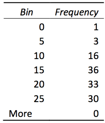 Step 2: Understand the Histogram Output. The Histogram analysis tool will output both Bin and Frequency data. An Example of such output is given here. The Frequency indicates the number of items from your data that fell between the previous and the current bin; i.e., a Frequency of 16 for Bin 10 says that the data you analyzed fell between the values of 5 and 10 a total of 16 times. The Bin ‘More’ represents the number of times the data you analyzed has a value more than your maximum bin boundary; i.e., a Frequency of 0 for the More Bin indicates that none of the data you analyzed had a higher value than 25.
Step 3: Create the Histogram Plot. Now you just need to make a bar graph of this data. Highlight the frequencies and click on the ‘Insert’ tab, then click ‘Column’ and select ‘2-D Column.’ To adjust the horizontal axis labels, click on the plot, right click, and choose ‘Select Data,’ then choose to edit the Horizontal Axis Labels. Title and label the plot appropriately. Tada!
Option #2: Using the Frequency Function
Suppose you want to produce a histogram showing the distribution of student grades on a recent exam. The following guide outlines the procedure you would need to follow.
Step 1: Scan your data to get a sense for the overall range of values. For our example, the grades fall between 50 and 100, so this is the range that our bins must span. The next decision is how fine you want the increment of your bins to be—the finer the increment, the more bins, and thus the more bars in our histogram. For our sample data set, a bin increment of 10 seems appropriate. Create a column next to the raw exam score data that shows the bin ranges, and a column to the right of that which shows the maximum values of your bins.
Step 2: Now use the Excel function FREQUENCY to determine how many values fall within each of the bins that you have defined. The FREQUENCY function is an array function, returning values to a range of cells. Follow the following steps to enter the FREQUENCY function:
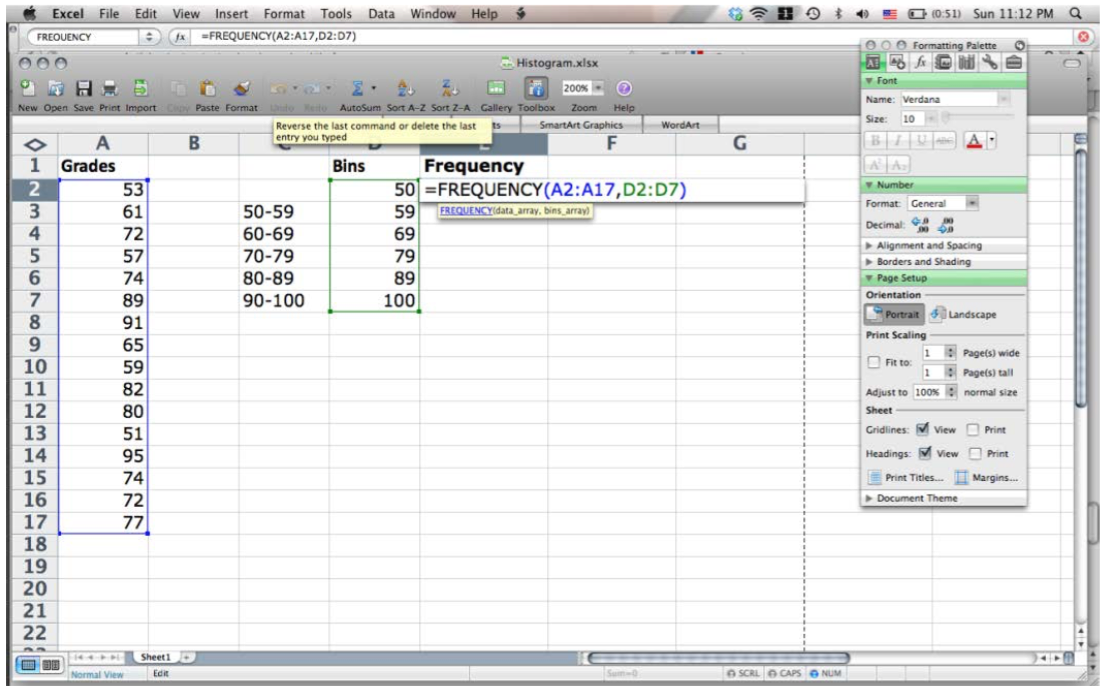
- Highlight the range of cells which will hold the frequency counts (E2:E7). These will be all of the Frequency Count cells next to the max bin values.
- Choose Insert>Function…, pick the Statistical Function category and scroll down in the box on the right and choose FREQUENCY as the Function name.
- Use the dialogue box to enter the function. With the Data_array box selected, go to the spreadsheet page and highlight the data values (A2:A17). The dialogue box with “roll up” while you highlight these values and then “roll down” when you are done.
- Repeat this process by selecting the Bins_array box and then go out the spreadsheet and highlight the bin limits cells (D2:D7).
- Click OK. The completed formula is seen in the formula bar and the correct count value is seen in the Bin Limit 50 count cell (E2).
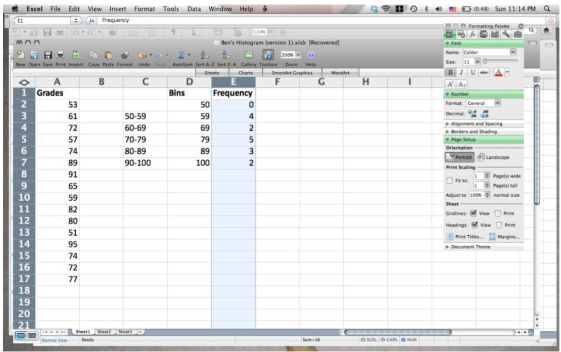
Step 3: Now copy the array function down to the other Frequency Count cells. This is a bit different than typical cell copying:
- With the Frequency Count cells still highlighted (E2:E7), click on the FREQUENCY function into the formula bar (i.e., =FREQUENCY(A2:A17,D2:D7)).
- Propagate the function by typing Control-Shift-Enter on a PC (type Command-Return on a Mac).
The frequency values should now fill the cells next to the bin increments. Note that your first bin increment, 50, holds all the grades at 50 and below. The next bin, 59, holds measurements from 50- 59, and so on.
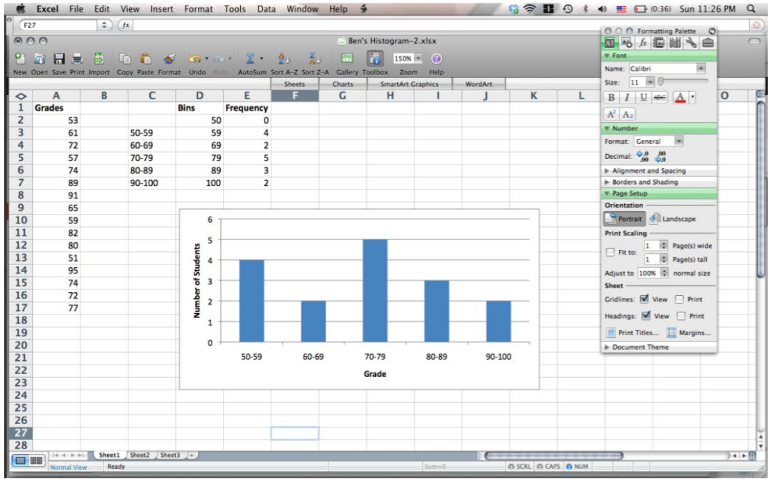
 Step 4: Create a bar chart plotting the frequency count (Column E) as a function of the student grade increments (Column C).
Other cool tools:
As a spreadsheet program, Excel can do a lot of useful statistical analysis and mathematical manipulation. Some functions you will find useful include: Sum, Average, and Standard Deviation.
To Sum elements, click on the cell in which you wish the result to appear, then enter ‘=sum.’ Immediately, Excel will list possible formula options that begin with ‘sum’. For a simple summation of elements, you would choose the SUM function, which you have already typed, but you should note the other options available. Open parentheses following your sum, so that you have now types ‘=sum(‘ and then highlight the cells to be summed. Close your parentheses and press ‘Enter.’ (It would look like this ‘=sum(A1:A5)’ for a sum of the cells in rows 1 through 5 of column A.)
To Average elements, click on the cell in which you wish the result to appear, and then enter ‘=average(.’ Highlight the cells you wish to average and then close your parentheses and press ‘Enter.’ Note that Excel will offer you a list of average functions—the most commonly used option is the AVERAGE function. (It would look like this ‘=average(A1:A5)’ for the average of the cells in rows 1 through 5 of column A.)
To perform a Standard Deviation on a set of elements, click on the cell in which you wish the result to appear, and then enter ‘=stdev(.’ Highlight the cells you wish to perform a standard deviation upon and then close your parentheses and press ‘Enter.’ Note that Excel will offer you a list of standard deviation functions—the most commonly used option is the STDEV function. (It would look like this ‘=stdev(A1:A5)’ for the standard deviation of the cells in rows 1 through 5 of column A.)
To perform any of these functions on disconnected sets of cells (e.g., cells in rows 1 through 13 and then 15 through 17), open your parentheses, highlight the first contiguous group, enter a comma, then highlight the next contiguous group, enter a comma, and so forth, continuing to the last group of numbers and ending with a closing parenthesis and the ‘Enter’ key. (As an example, ‘=average(A1:A13,A15:A17)’.)
Excel has many other functions available, including trigonometric and logarithmic functions. Investigate what is available by clicking on the ‘Formulas’ tab and looking through the ‘Function Library,’ especially the ‘Math & Trig’ and ‘More Functions’ menus.